Drawing Class Report
I've been taking a class on basic drawing from Craig Birch at The Scottsdale Artist's School for the past month. The teacher is really good and he happens to be focusing on what I really need to practise. Yes, I went to art school before reality cracked me upside of the head and I got a business degree. Yes, I knew this stuff was important. But somehow, I never managed to pull myself together long enough to do what I needed to do to improve my paintings. No wonder I'm rarely inspired to paint!
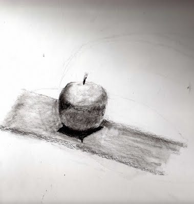 I did this apple in the first class. I thought it sucked but others liked it. It does pretty much look like an apple. By the way, these scans suck because my scanner only goes up to 8.75 x 14 inches and my paper is 14 x 17 inches. Here's the homework I did that week. Weak is the word!
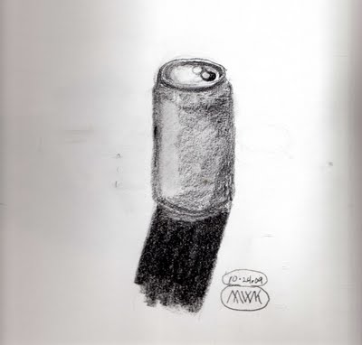 So the next week, we had a vase and a ceramic bottle to draw. I did better on those. I was getting into it. When I figure out which drawing pad that one is in, I'll scan it. It's large so it might not fit on the scanner bed. I had bought a different paper from the one specified in the supply list and went out and got the proper one at another art supply store. (Yes, it killed me to go to a bigger, better store and buy art supplies. I'm surprised that my debit card survived!)
So, being inspired by the ceramics we had drawn in class, I found my favorite teapot at home and drew this.
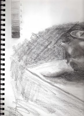 You may have noticed that this is only the left half of the teapot and that it appears that I drew right up to the edge of the paper. I didn't. It's a pity because I think it's my best drawing so far. It was too large for the scanner bed and the two sides didn't scan in with the same values so combining the two in Photoshop Elements was a waste of time. The differences are too distracting to give a good view of it. Maybe later when I set up to photograph these. My favorite camera for doing still lifes and set shots (Sony S-145) is being temperamental, so I don't know when that will happen.
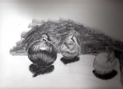
For the next class, Craig set up a still life with a white onion, a green pear, and a red onion. Three values to show together in one drawing.
When I stopped to grocery shop on the way home (I like being there after 10 PM when I have the store all to myself!), I was inspired to buy some pomegranates to use for my drawing practise. I set these all up on a tray table about 4 feet away from me with an Ott light focused on them from the side.
 The first drawing took a couple of hours and I was fairly pleased with it. For this second one, I just couldn't get into it and spent only about 15 minutes. Still, I like it. It shows most of the important stuff, the mid-tones, shadow, cast shadow, and reflected shadow are all there and fairly accurately.
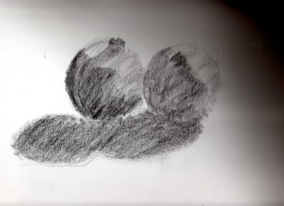
Good choices in relative values lie at the heart of every successful painting. There is even a technique wherein the painter first makes a drawing, paints it in grey-scale values only and then when that is right, applies the colors.
I did this apple in the first class. I thought it sucked but others liked it. It does pretty much look like an apple. By the way, these scans suck because my scanner only goes up to 8.75 x 14 inches and my paper is 14 x 17 inches. Here's the homework I did that week. Weak is the word!So the next week, we had a vase and a ceramic bottle to draw. I did better on those. I was getting into it. When I figure out which drawing pad that one is in, I'll scan it. It's large so it might not fit on the scanner bed. I had bought a different paper from the one specified in the supply list and went out and got the proper one at another art supply store. (Yes, it killed me to go to a bigger, better store and buy art supplies. I'm surprised that my debit card survived!)So, being inspired by the ceramics we had drawn in class, I found my favorite teapot at home and drew this.
You may have noticed that this is only the left half of the teapot and that it appears that I drew right up to the edge of the paper. I didn't. It's a pity because I think it's my best drawing so far. It was too large for the scanner bed and the two sides didn't scan in with the same values so combining the two in Photoshop Elements was a waste of time. The differences are too distracting to give a good view of it. Maybe later when I set up to photograph these. My favorite camera for doing still lifes and set shots (Sony S-145) is being temperamental, so I don't know when that will happen.For the next class, Craig set up a still life with a white onion, a green pear, and a red onion. Three values to show together in one drawing.
When I stopped to grocery shop on the way home (I like being there after 10 PM when I have the store all to myself!), I was inspired to buy some pomegranates to use for my drawing practise. I set these all up on a tray table about 4 feet away from me with an Ott light focused on them from the side.
The first drawing took a couple of hours and I was fairly pleased with it. For this second one, I just couldn't get into it and spent only about 15 minutes. Still, I like it. It shows most of the important stuff, the mid-tones, shadow, cast shadow, and reflected shadow are all there and fairly accurately.We're using graphite and charcoal pencils (that I've never liked and now loathe!) and playing with values and light and shapes. Now, everything I look at is evaluated in terms of shadow shapes and highlights. I even caught myself doing it at the grocery store after class last night!
I am in LOVE with these Cretacolor Monolith Graphite Sticks! I bought 5 more of the 9B sticks yesterday so I'll always have one. I can't wait to try applying watercolor over a value drawing done with graphite. I bought the set because I love boxes and can rarely resist one. I'm glad I did though because I love the pencil sharpener and eraser that came with it. I've been playing with the varying hardnesses, too. It starts at HB and goes down to 9B. The middle value, 4B, is a different color outside. One of the things I like about the graphite sticks is that you don't have paint from a pencil smearing onto your paper and it lets you have a really long point on your drawing tool.
I've begun to like the process of sorting out and evaluating all the shapes and their relationships spatially as well as their values. In the past, I've been really impatient. I don't paint because I don't want to bother to set up a scene to paint. I don't paint because I don't want to do all the preliminaries such as figuring out the values and other relationships between the shapes that describe the objects. So now maybe my impatience is re-focused.
I just can't wait for Monday nights these days, even if it does include grocery shopping!
Labels: art, Craig Birch, drawing, graphite sticks, Scottsdale Artists School
posted by Wabbit at
4:40 PM
![]()
![]()


3 Comments:
I also have some of the Cretacolor graphite pencils and I love them too. Your pencil drawings are beautiful. I especially like the onions and pear and pomegranites. Hope we'll see more of your pieces as you work through the course.
Who knows where to download XRumer 5.0 Palladium?
Help, please. All recommend this program to effectively advertise on the Internet, this is the best program!
I am really impressed with your drawing skills...I need that class!
Post a Comment
Links to this post:
Create a Link
<< Home